このガイドでは、QML のコントロールにフェードイン/フェードアウト効果を追加する方法を示します。 Qt/QML には多くの組み込みアニメーションがありますが、フェードイン/フェードアウトはありません。ステート マシンと SequentialAnimation の使用 、最初に不透明度をアニメーション化し、次に可視性を設定して、フェードイン/フェードアウト効果を実現できます。 PropertyAnimation のような他の方法 も利用できますが、表現力や構成可能性は低くなります。
visibility bool であるため、アイテムのプロパティを直接アニメーション化することはできません .したがって、opacity をアニメーション化する必要があります 0.0 から 1.0 までの数値です。 NumberAnimation の使用 期間を制御し、それらを SequentialAnimation に入れます それらを順番に発生させます。すべての QML コントロールが (項目を非表示にするときに効果の順序を反転するために) 持っている組み込みのステート マシンと組み合わせることで、独自の QML コントロール用に C++ でカスタム OpenGL コードを記述することに頼ることなく、適切にアニメーション化されたフェードイン/フェードアウトを実現できます。
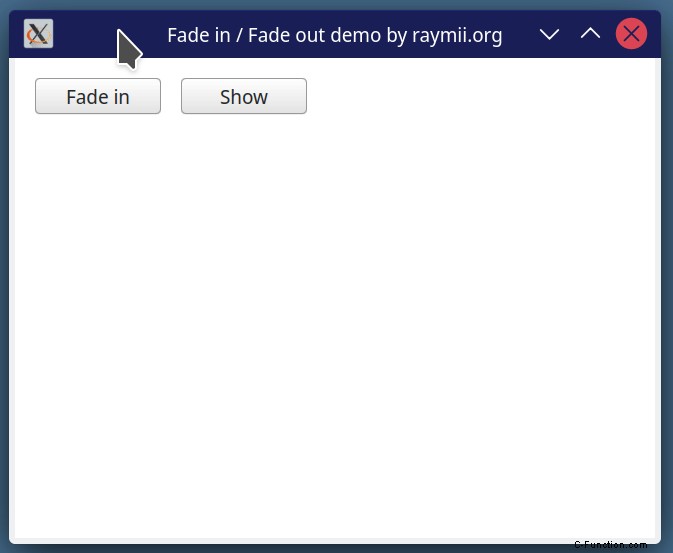
これは、完全な効果と、可視性を切り替えたときの外観を示す GIF です:
これは複雑ですか?はい、そう思います。フェードイン/フェードアウト効果のためのステート マシン全体です。 Qt/QML が組み込みの標準ライブラリを使用してこれを一緒にハックできるのはいいことですか?はい、そう思います。たとえば、組み込みの inblur エフェクトの 1 つと同じように、単純に適用できるエフェクトが必要ですか?はい、それはさらに良いでしょう。他のアニメーションやエフェクトは簡単に実行できるので、このエフェクト用のビルトインを追加してみませんか?
QML フェードイン / フェードアウト
次のステート マシンとトランジションを QML コントロールに追加し、ステートをプロパティにバインドするか、直接トリガーします。コントロールの ID は exampleControl です フェードイン/フェードアウト アニメーションをトリガーするために使用するプロパティの名前は folded です .
id: exampleControl
property bool folded: false
state: !folded ? "Visible" : "Invisible"
states: [
    State{
        name: "Visible"
        PropertyChanges{target: exampleControl; opacity: 1.0}
        PropertyChanges{target: exampleControl; visible: true}
    },
    State{
        name:"Invisible"
        PropertyChanges{target: exampleControl; opacity: 0.0}
        PropertyChanges{target: exampleControl; visible: false}
    }
]

transitions: [
    Transition {
        from: "Visible"
        to: "Invisible"

        SequentialAnimation{
            NumberAnimation {
                target: exampleControl
                property: "opacity"
                duration: 500
                easing.type: Easing.InOutQuad
            }
            NumberAnimation {
                target: exampleControl
                property: "visible"
                duration: 0
            }
        }
    },

    Transition {
        from: "Invisible"
        to: "Visible"
        SequentialAnimation{
            NumberAnimation {
                target: exampleControl
                property: "visible"
                duration: 0
            }
            NumberAnimation {
                target: exampleControl
                property: "opacity"
                duration: 500
                easing.type: Easing.InOutQuad
            }
        }
    }
]
完全なサンプル ソース コード
これは、記事内の記録された GIF を作成するコードです。アニメーション コードと、それをトリガーできるプロパティにバインドする方法を示します。 stackoverflow でステート マシンの例を見つけましたが、ブラウザの履歴で特定のトピックを見つけることができなくなったため、ソースの例にリンクできません。知っている場合は、この記事を更新できるようにメールを送ってください。
import QtQuick 2.15
import QtQuick.Controls 1.4
import QtQuick.Window 2.15

Window {
    width: 640
    height: 480
    visible: true
    title: qsTr("Fade in / Fade out demo by raymii.org")

    Column {
        anchors.fill: parent
        anchors.margins: 20
        spacing: 20

        Row {
            spacing: 20
            Button {
                text: fadeRect.folded ? "Fade in" : "Fade out"
                onClicked: fadeRect.folded = !fadeRect.folded
            }

            Button {
                text: toggleRect.visible ? "Hide" : "Show"
                onClicked: toggleRect.visible = !toggleRect.visible
            }

        }

        Rectangle {
            id: fadeRect
            width: 410
            height: 60
            border.width: 3
            property bool folded: true
            border.color: "#cccccc"
            color: "#efefef"

            Row {
                anchors.fill: parent
                anchors.margins: 10
                spacing: 5

                Button {
                    text: "Button 1"
                }
                Button {
                    text: "Button 2"
                }
                Button {
                    text: "Button 3"
                }
            }


            state: !folded ? "Visible" : "Invisible"
            states: [
                State{
                    name: "Visible"
                    PropertyChanges{target: fadeRect; opacity: 1.0}
                    PropertyChanges{target: fadeRect; visible: true}
                },
                State{
                    name:"Invisible"
                    PropertyChanges{target: fadeRect; opacity: 0.0}
                    PropertyChanges{target: fadeRect; visible: false}
                }
            ]

            transitions: [
                Transition {
                    from: "Visible"
                    to: "Invisible"

                    SequentialAnimation{
                        NumberAnimation {
                            target: fadeRect
                            property: "opacity"
                            duration: 500
                            easing.type: Easing.InOutQuad
                        }
                        NumberAnimation {
                            target: fadeRect
                            property: "visible"
                            duration: 0
                        }
                    }
                },

                Transition {
                    from: "Invisible"
                    to: "Visible"
                    SequentialAnimation{
                        NumberAnimation {
                            target: fadeRect
                            property: "visible"
                            duration: 0
                        }
                        NumberAnimation {
                            target: fadeRect
                            property: "opacity"
                            duration: 500
                            easing.type: Easing.InOutQuad
                        }
                    }
                }
            ]

        }


        Rectangle {
            id: toggleRect
            width: 410
            height: 60
            border.color: "#cccccc"
            color: "#efefef"
            border.width: 3
            visible: false

            Row {
                anchors.fill: parent
                anchors.margins: 10
                spacing: 5

                Button {
                    text: "Button 1"
                }
                Button {
                    text: "Button 2"
                }
                Button {
                    text: "Button 3"
                }
            }
        }
    }
}